
Muihood
Muihood
Rebranding a Holistic Skincare Brand Rooted in Traditional Chinese Medicine
Rebranding a Holistic Skincare Brand Rooted in Traditional Chinese Medicine
Rebranding a Holistic Skincare Brand Rooted in Traditional Chinese Medicine
Good Brand Studio: Re-brand strategy and packaging design
Good Brand Studio: Re-brand strategy and packaging design
Good Brand Studio: Re-brand strategy and packaging design
project overview
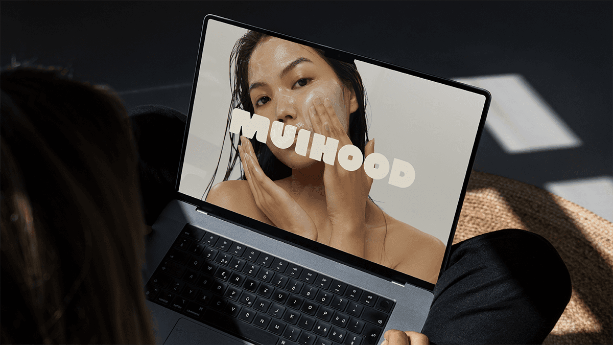
Muihood is a skincare brand modernising Traditional Chinese Medicine (TCM) for a new generation. Rooted in centuries-old practices, the brand bridges ancient wisdom with contemporary skincare needs—offering herbal remedies through a modern lens. Muihood empowers a new wave of skincare consumers to explore holistic wellness with authenticity, integrity, and intention.
Muihood is a skincare brand modernising Traditional Chinese Medicine (TCM) for a new generation. Rooted in centuries-old practices, the brand bridges ancient wisdom with contemporary skincare needs—offering herbal remedies through a modern lens. Muihood empowers a new wave of skincare consumers to explore holistic wellness with authenticity, integrity, and intention.
Muihood is a skincare brand modernising Traditional Chinese Medicine (TCM) for a new generation. Rooted in centuries-old practices, the brand bridges ancient wisdom with contemporary skincare needs—offering herbal remedies through a modern lens. Muihood empowers a new wave of skincare consumers to explore holistic wellness with authenticity, integrity, and intention.
challenge
Muihood needed a rebrand that would honour its cultural heritage while elevating its aesthetic to meet the expectations of today’s beauty consumer. The visual identity and packaging had to reflect both the depth of TCM and the sleek, minimalist codes of modern skincare—without compromising on either. The challenge was to find that intersection of heritage and high design, and express it across every touchpoint.
Muihood needed a rebrand that would honour its cultural heritage while elevating its aesthetic to meet the expectations of today’s beauty consumer. The visual identity and packaging had to reflect both the depth of TCM and the sleek, minimalist codes of modern skincare—without compromising on either. The challenge was to find that intersection of heritage and high design, and express it across every touchpoint.
Muihood needed a rebrand that would honour its cultural heritage while elevating its aesthetic to meet the expectations of today’s beauty consumer. The visual identity and packaging had to reflect both the depth of TCM and the sleek, minimalist codes of modern skincare—without compromising on either. The challenge was to find that intersection of heritage and high design, and express it across every touchpoint.
I led a full brand identity and packaging refresh that carefully blended tradition with contemporary design principles, crafting a visual language that feels grounded, aspirational, and culturally respectful.
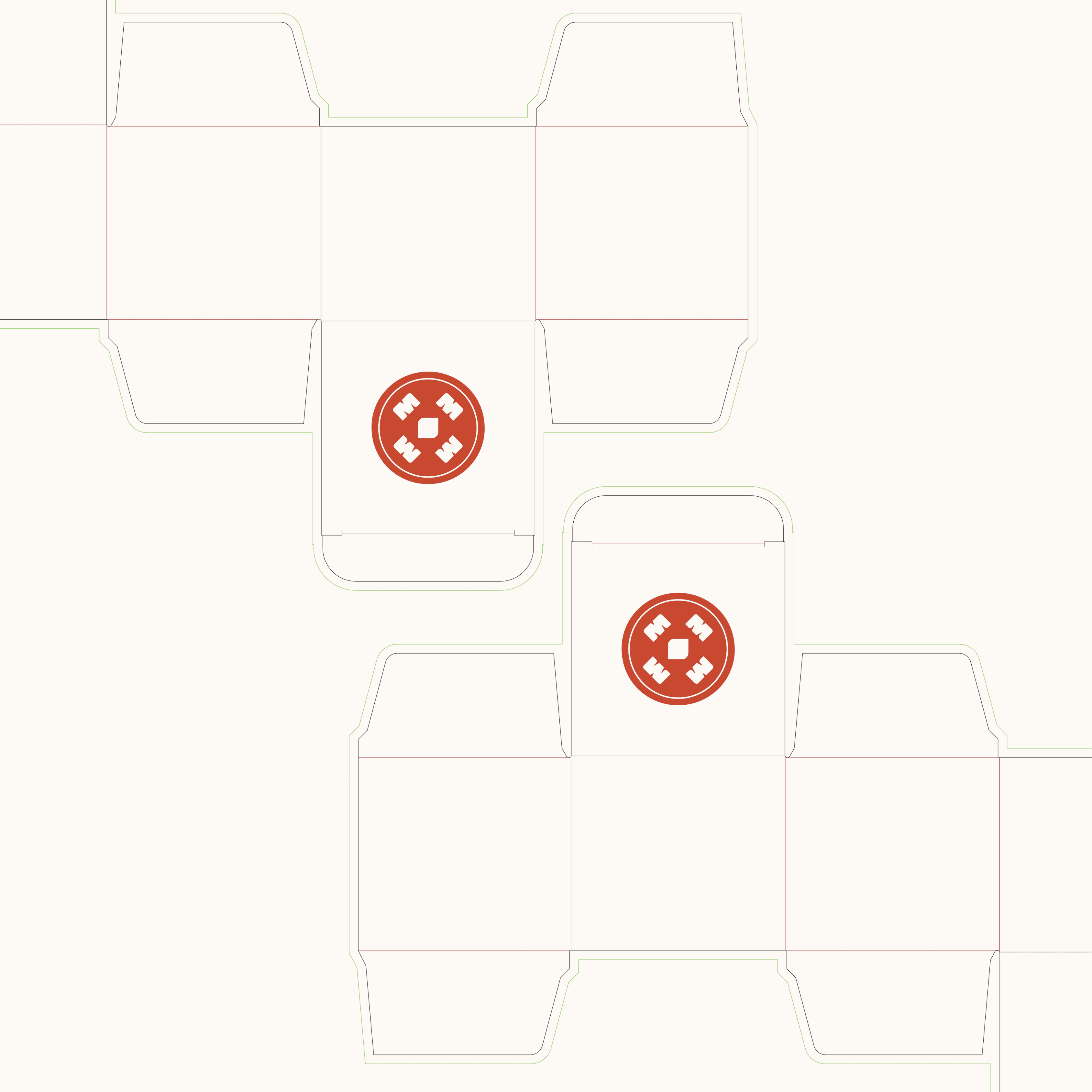
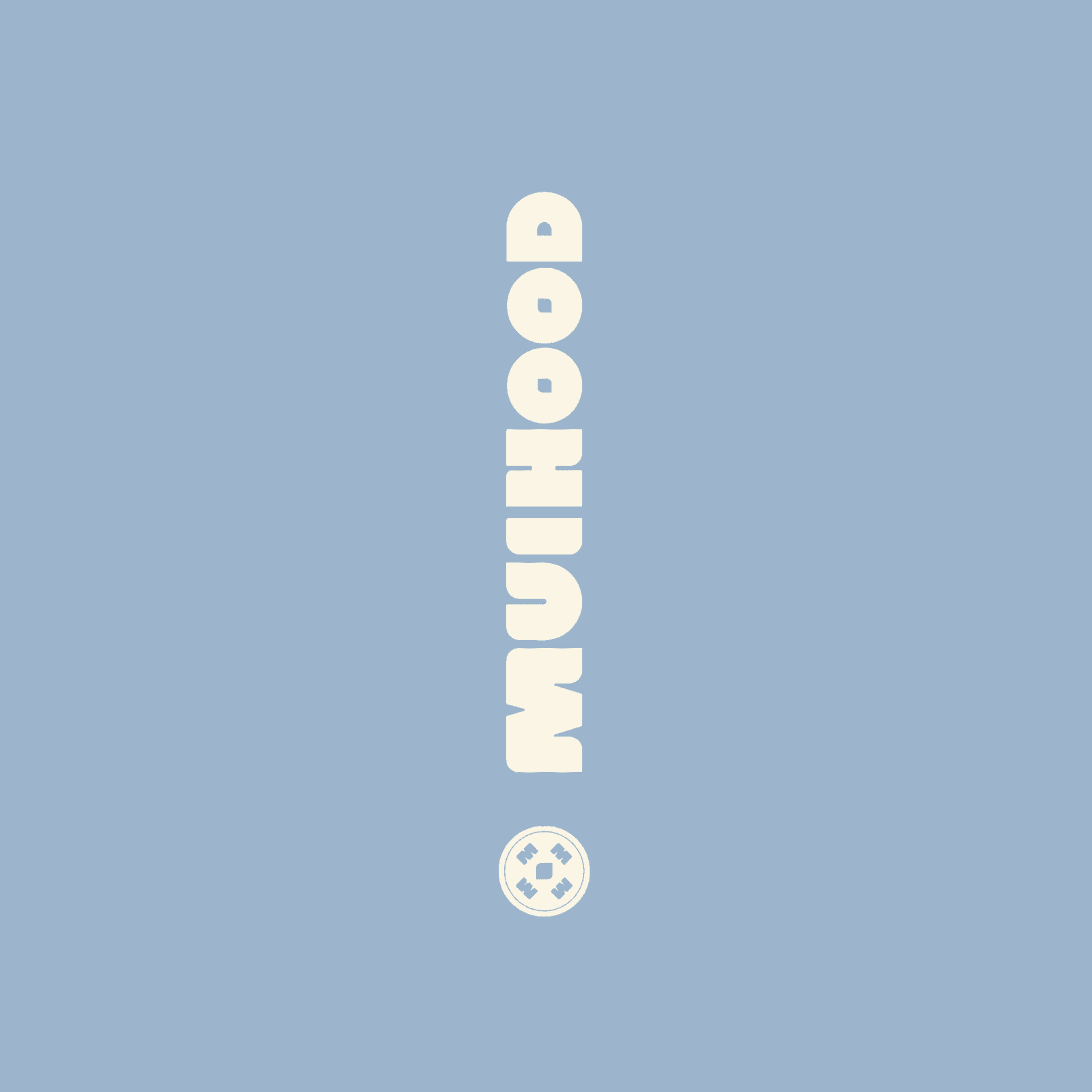
Logo Design
A modernised wordmark rooted in simplicity and elegance, subtly referencing Eastern design cues while maintaining universal appeal.
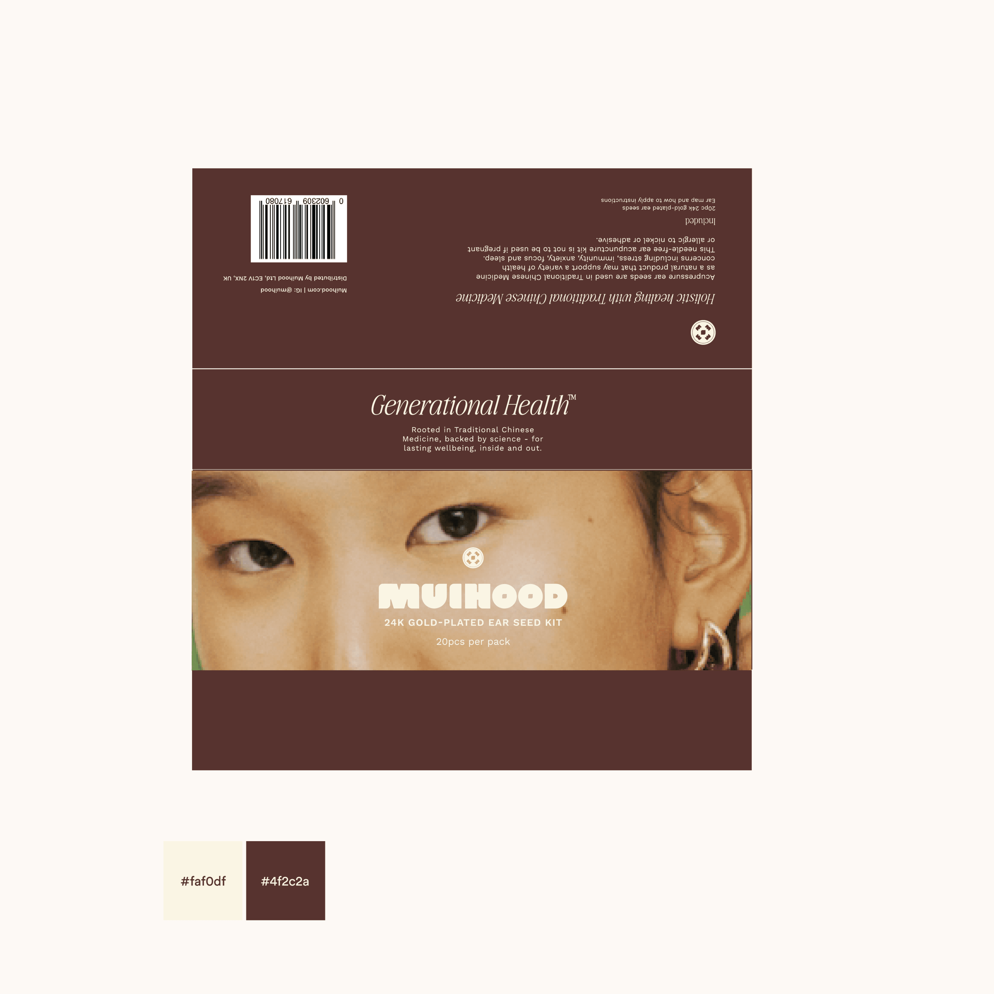
Colour Palette
A calm, earthy system inspired by the natural elements in TCM—think healing herbs, warm clays, and soothing botanicals—designed to evoke balance, warmth, and rejuvenation.
Typography
A refined, editorial pairing of serif and sans-serif fonts to strike a balance between approachability and luxury.
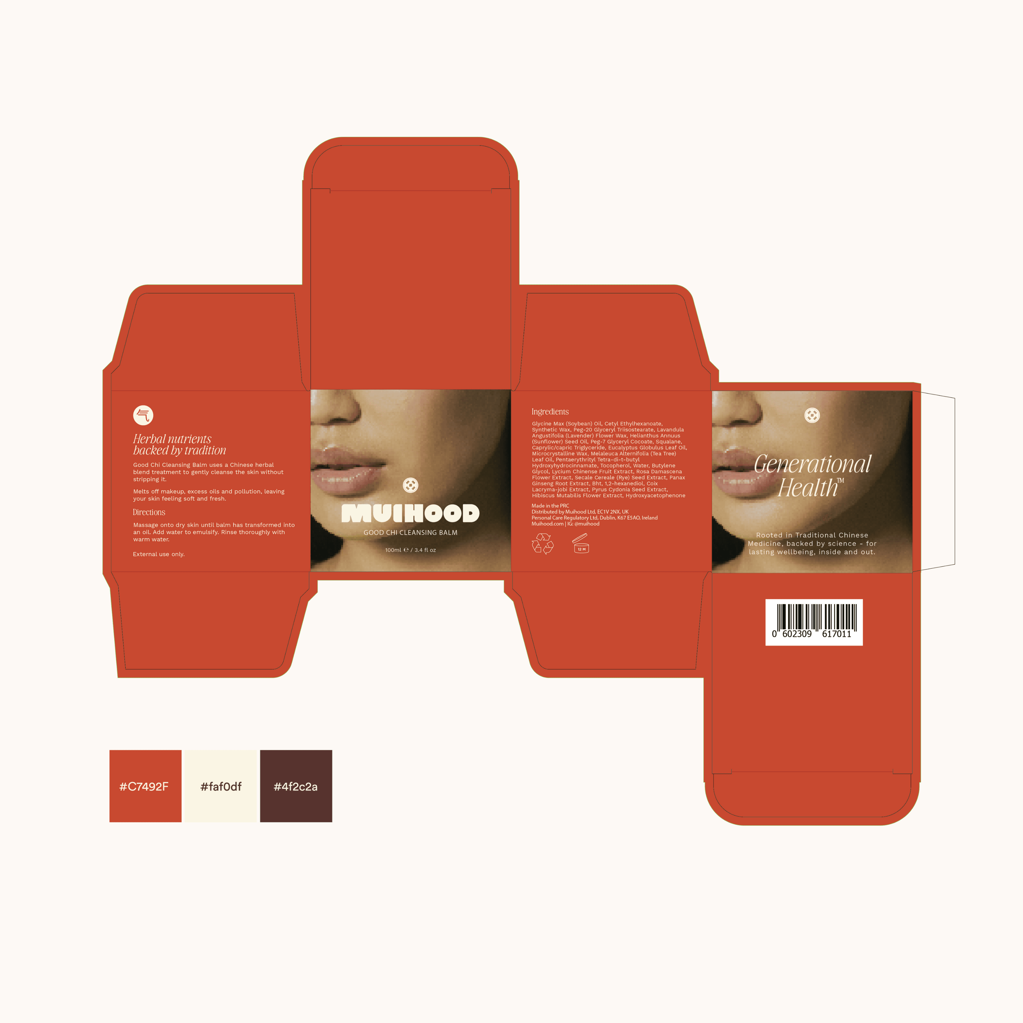
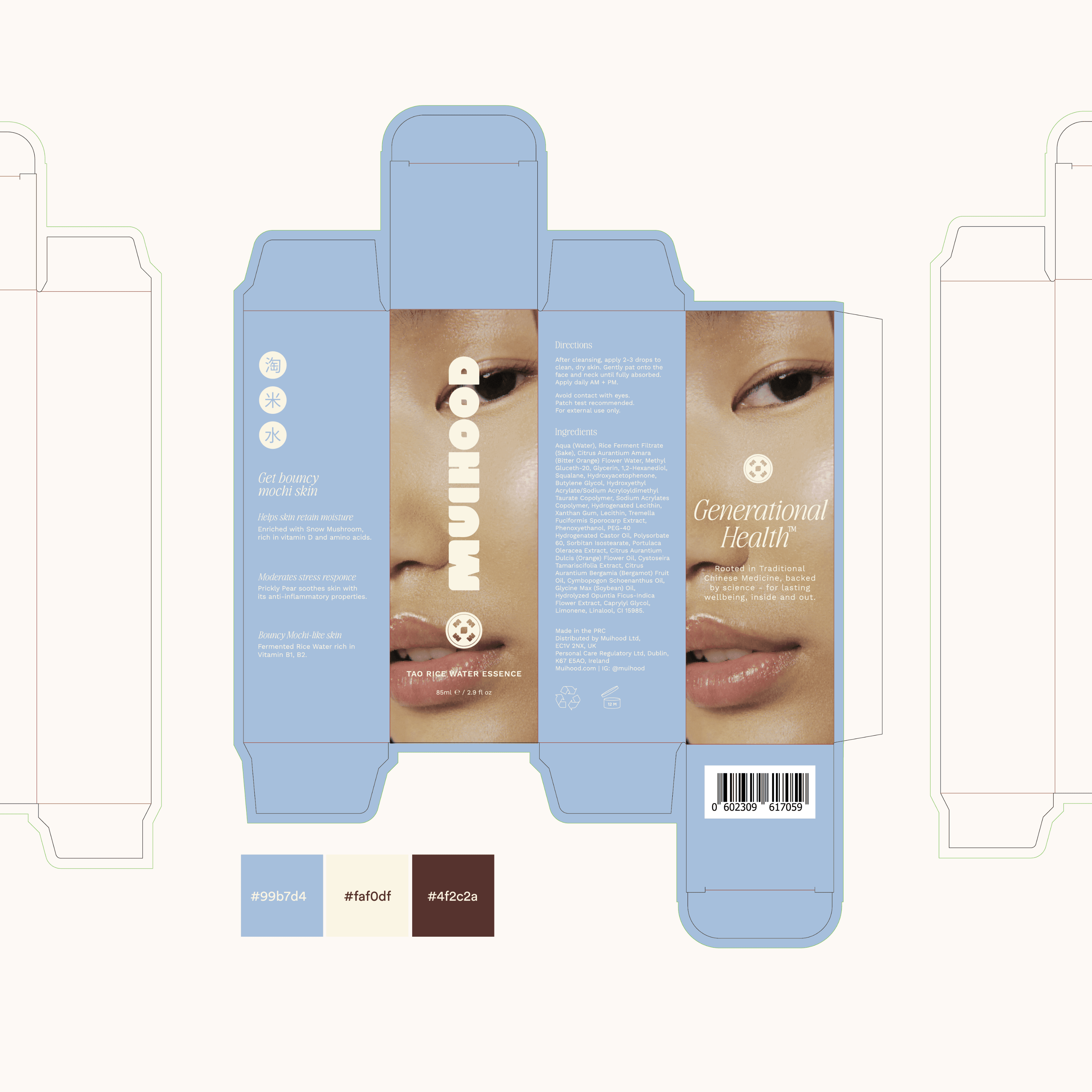
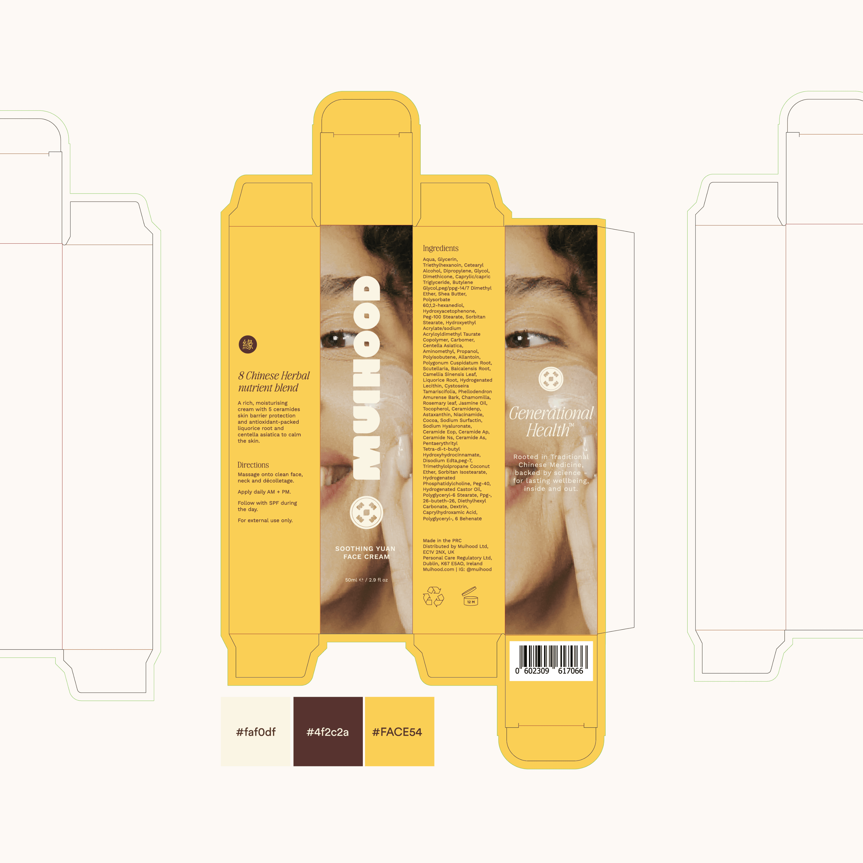
Packaging Redesign
Created sleek, tactile packaging that reflects the brand’s holistic values and positions Muihood as a premium player in the wellness space. Thoughtful layouts, natural textures, and space-conscious design ensure both shelf appeal and brand integrity.
Visual Assets & Brand Book
Delivered a full brand identity book outlining usage, visual tone, and strategic direction to guide future growth and ensure consistency across channels.
Logo Design
A modernised wordmark rooted in simplicity and elegance, subtly referencing Eastern design cues while maintaining universal appeal.
Colour Palette
A calm, earthy system inspired by the natural elements in TCM—think healing herbs, warm clays, and soothing botanicals—designed to evoke balance, warmth, and rejuvenation.
Typography
A refined, editorial pairing of serif and sans-serif fonts to strike a balance between approachability and luxury.
Packaging Redesign
Created sleek, tactile packaging that reflects the brand’s holistic values and positions Muihood as a premium player in the wellness space. Thoughtful layouts, natural textures, and space-conscious design ensure both shelf appeal and brand integrity.
Visual Assets & Brand Book
Delivered a full brand identity book outlining usage, visual tone, and strategic direction to guide future growth and ensure consistency across channels.

impact
The refreshed Muihood identity repositions the brand as a leader in modern holistic skincare. By bridging culture and contemporary design, the rebrand has elevated Muihood’s presence both online and on shelves, reinforcing its credibility, deepening emotional resonance, and opening doors to new customers and retail partnerships. The brand now moves confidently through a competitive space—with a story, and identity, that feels both timeless and timely.
The refreshed Muihood identity repositions the brand as a leader in modern holistic skincare. By bridging culture and contemporary design, the rebrand has elevated Muihood’s presence both online and on shelves, reinforcing its credibility, deepening emotional resonance, and opening doors to new customers and retail partnerships. The brand now moves confidently through a competitive space—with a story, and identity, that feels both timeless and timely.

say hello
say hello


contact us
daniella@goodbrandday.com
contact us
daniella@goodbrandday.com
contact us
daniella@goodbrandday.com
© 2025 Good Brand Day. All Rights Reserved